
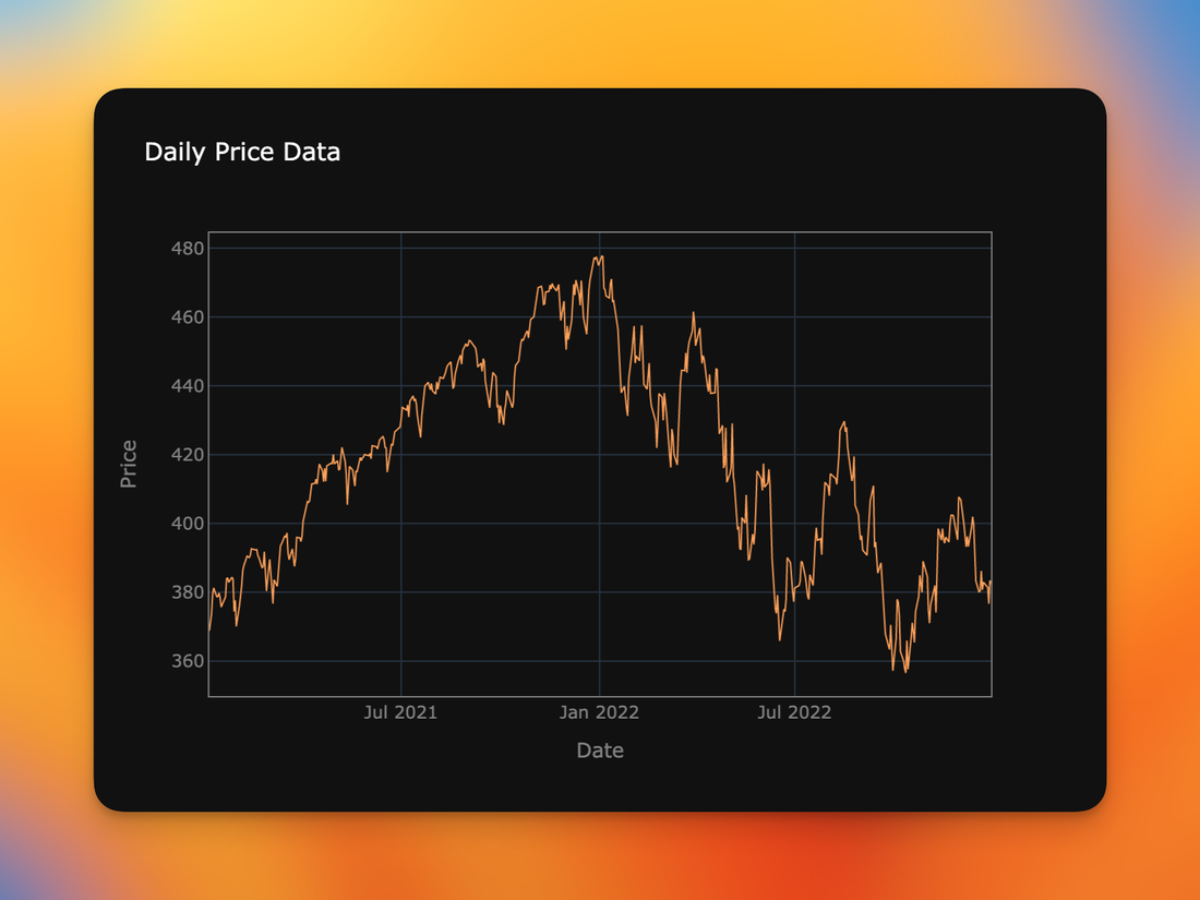
The Plotly graphics library is a rich, fully-featured toolkit with support for many types of charts and data visualizations. I use it regularly for creating plots of time-series data such as stock prices, and have usually found that regardless of whatever special feature or customization I’m looking for, Plotly has a way to support it. However, sometimes it can be difficult to figure out how to accomplish what I'm trying to do because of the large set of options in the library. Even with its excellent documentation, I sometimes am not sure what the feature I’m looking for is called so it can be difficult to find the right option or technique when you don't know what to search for.
Day Gaps
One example that comes up frequently with time-series data is excluding natural time gaps inherent in the data. For example, stock prices are only available on valid trading days (non-holiday weekdays) and during times when the exchange is open (usually 9:30 am to 4:00 pm). Without making adjustments, a plot of the data can give the wrong impression that the price did not vary across these periods. For example, look at the price between May 28th and June 1st below.
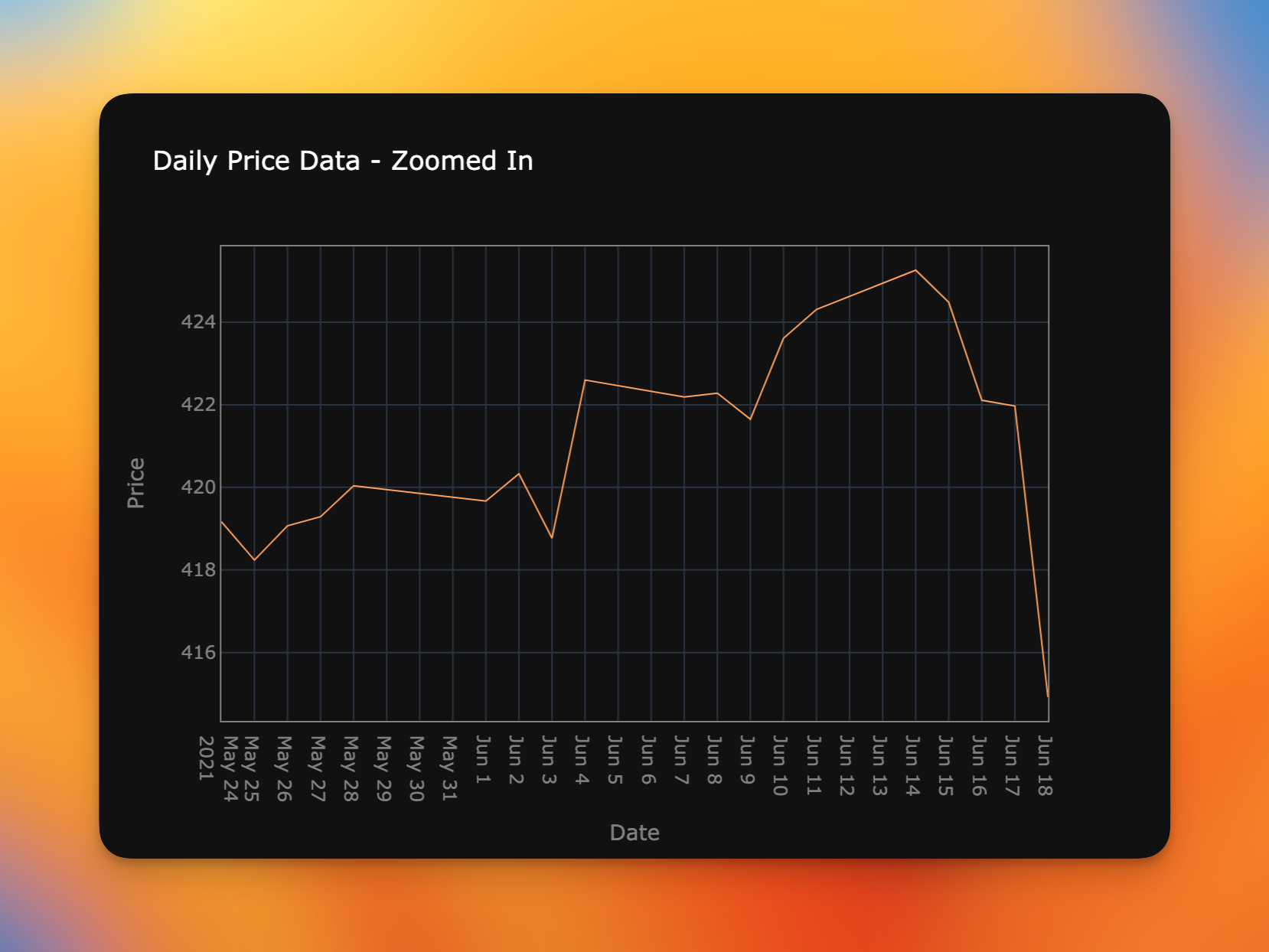
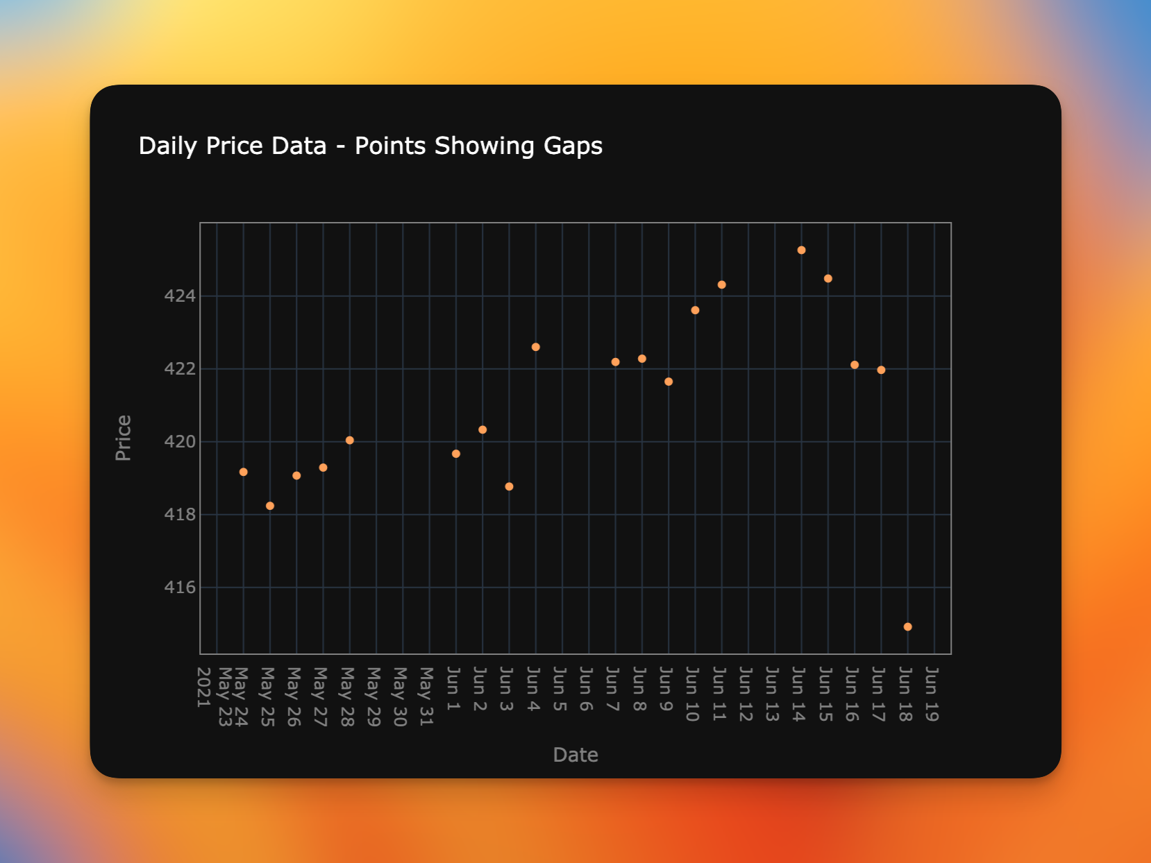
One might conclude that the price gradually declined over those four days. Showing the same data again, but this time with markers instead of lines reveals dates with no data. In this case, May 29th and 30th were a weekend and May 31st was an exchange holiday. Gaps are also made clear for the weekends of June 5-6, and June 12-13.
To address this, Plotly offers the rangebreaks option for the x- and y-axes, but the option can be a little confusing to use. You pass it a list of dicts that define ranges or individual points to exclude from the axis.
fig.update_xaxes(
    rangebreaks=[
        dict(bounds=["sat", "mon"]),
        dict(values=["2021-05-31"]) # Memorial Day
    ]
)
Here we are saying that all weekends and one specific date should be hidden from view. But the bounds form is a little confusing as it is left-inclusive but right-exclusive, so the range ["sat", "mon"] says that Saturday and Sunday—but not Monday—should be excluded.
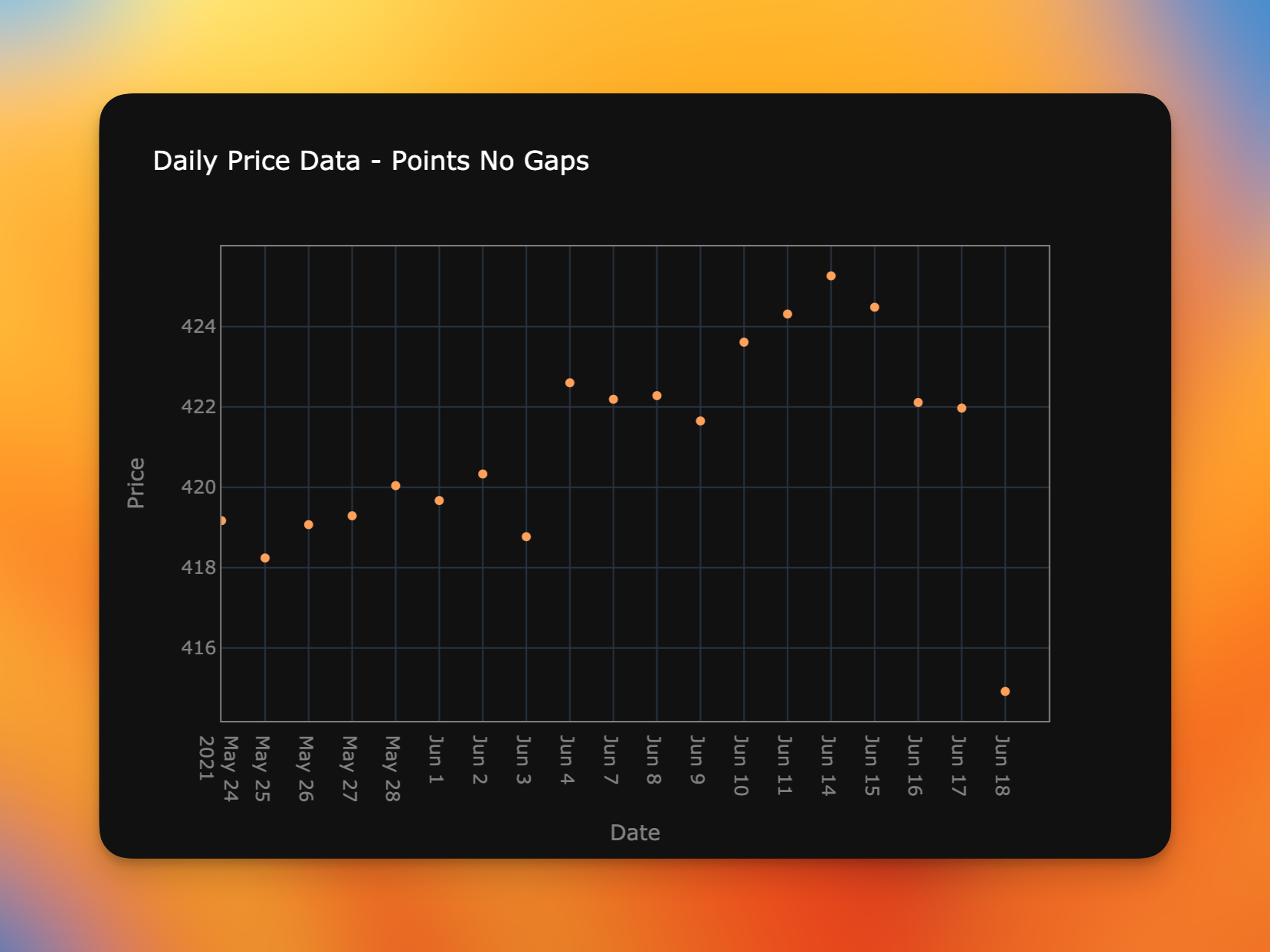
Here is a plot with the rangebreaks applied and you can see those dates have now been removed. The plot is now more representative of how the price evolved each day where trading occurred.
rangebreaks are now removed from the chartIntraday Gaps
Natural gaps also occur in data with a higher resolution than daily observations. Here we are showing prices covering one-minute "bars" over a 12-day period. Note that relatively small intervals where there is any sort of price action compared to the larger, linear sections of the chart. The active ranges occur during the hours where the stock market was open (9:30am to 4:00pm EST). That's only 6.5 hours out of a 24-day interval so you can see that the majority of the time periods are really just gaps with no data samples.
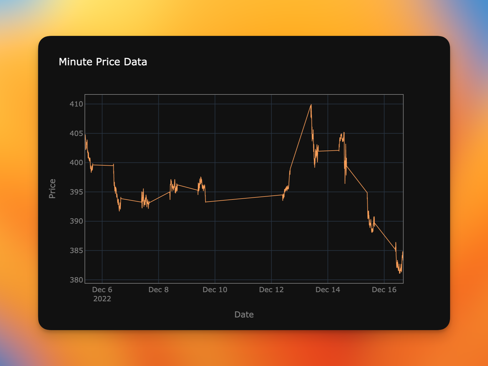
Once again, this is clear when we use markers rather than lines to plot the data. Below you can see the overnight gaps (between 4pm and 9:30am on T+1) and also the large weekend gap between 4pm on December 9th through 9:30am on December 12th.

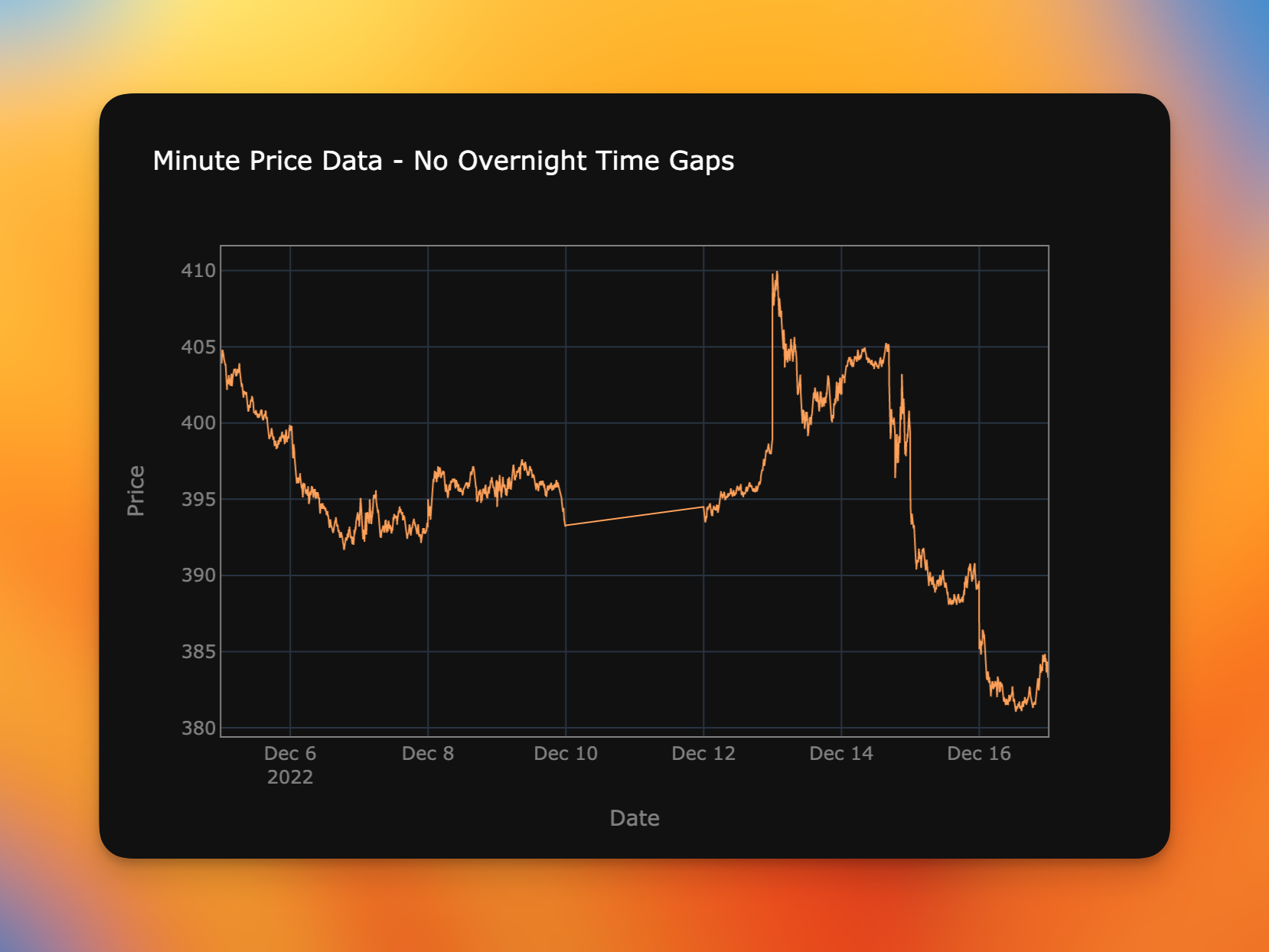
We can use the same technique to remove the overnight gaps but this time we use numbers for the hour range we want to skip and add the pattern option to specify how the bounds values should be interpreted.
fig.update_xaxes(
    rangebreaks=[
        dict(bounds=[16, 9.5], pattern="hour")
    ]
)
This removes the overnight gaps, yielding a plot that's much more understandable to the viewer. However, we still have the weekend gap spanning December 10th-11th.
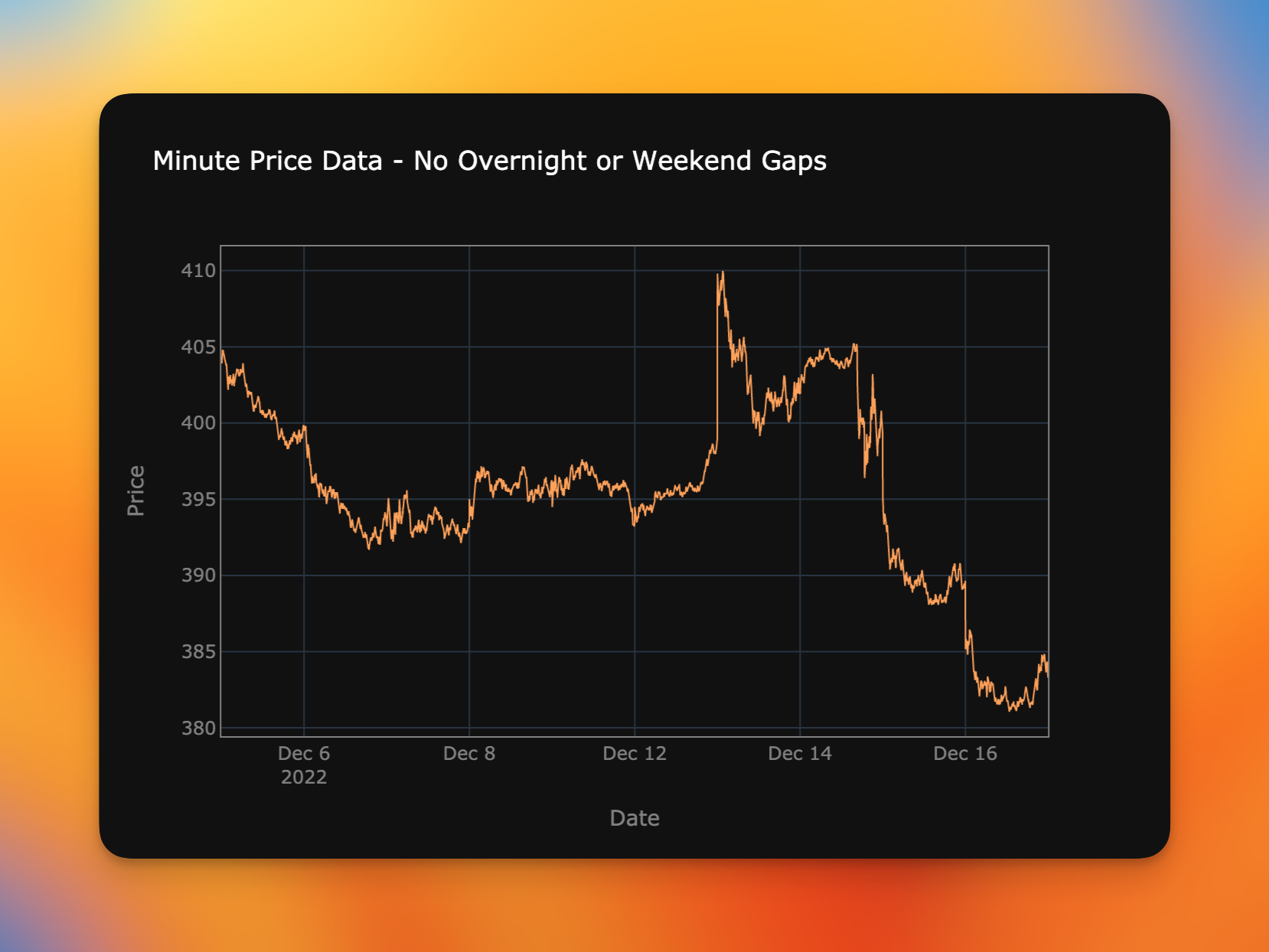
That can be fixed by combining the method we used for hiding weekend days with the form for removing intraday gaps.
fig.update_xaxes(
    rangebreaks=[
        dict(bounds=["sat", "mon"]),
        dict(bounds=[16, 9.5], pattern="hour")
    ]
)
The final result produces a chart that shows how the price evolved minute-by-minute over a multi-day period without the visual clutter of large gaps where no prices occurred.
Code
A notebook and sample datasets for these examples are available here.